

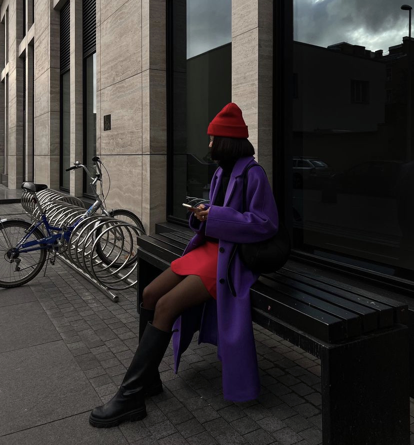
For many, autumn (read: almost everyone) is associated with a muted color palette. Vanilla latte coat, beige trench coat, brown sweater, dark green pants and a wet asphalt scarf – with the onset of the cold season and the first fallen leaves, the number of images featuring these wardrobe items begins to increase.
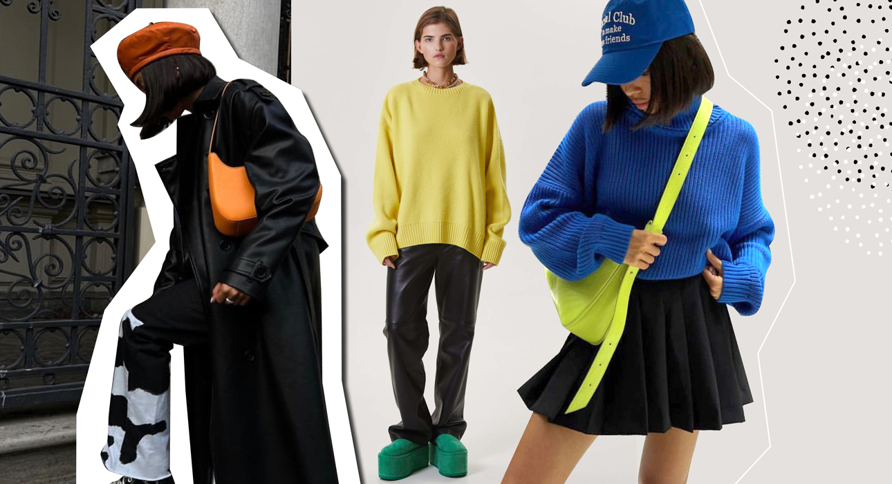
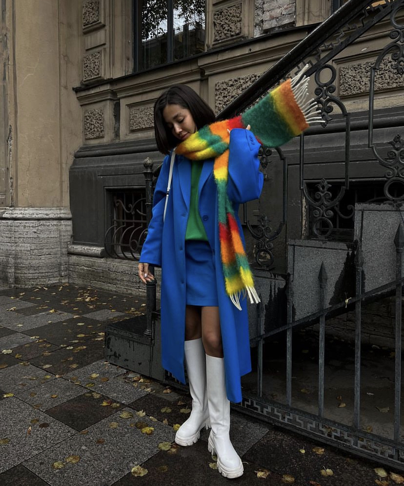
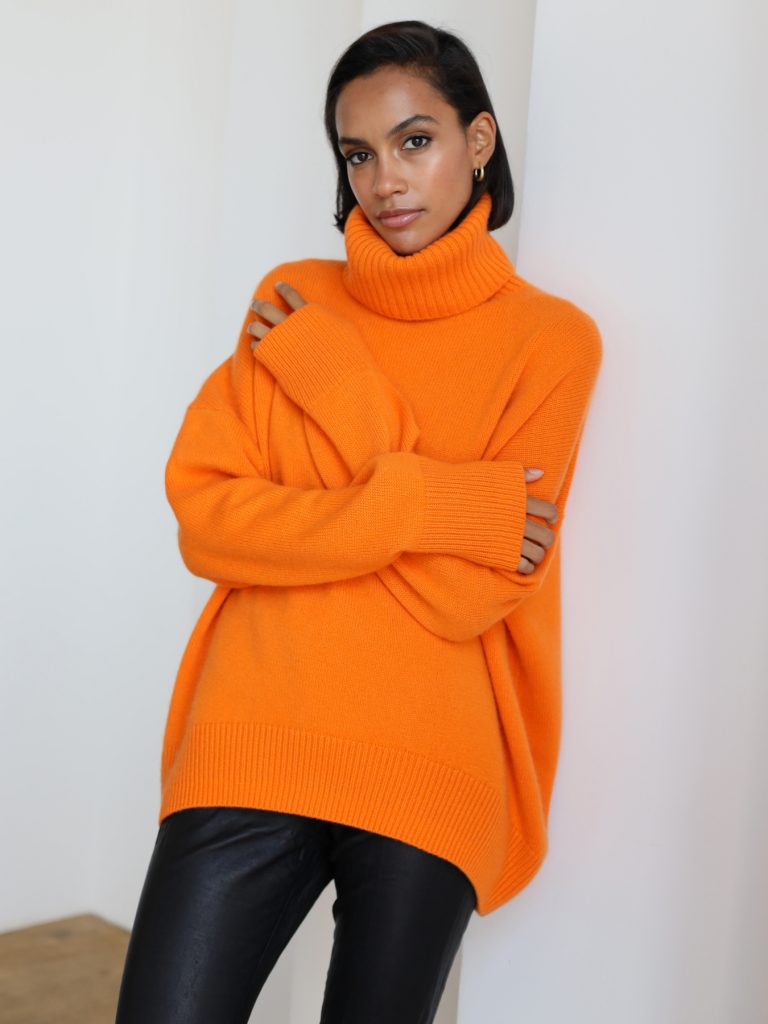
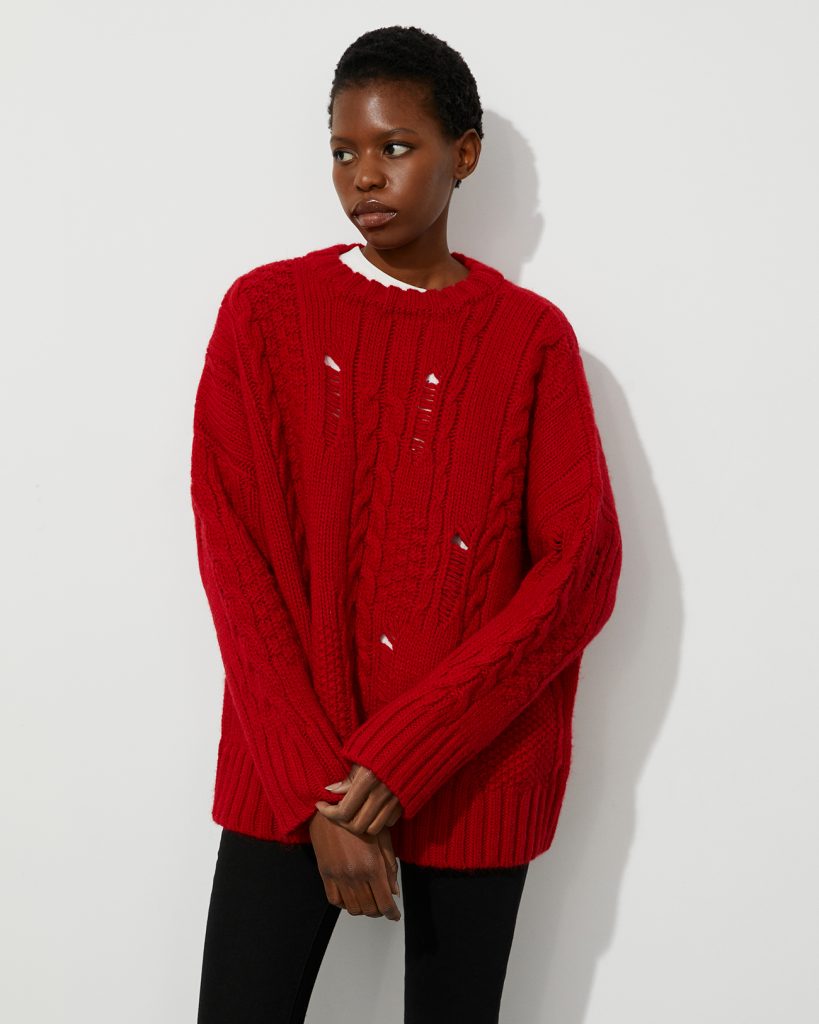
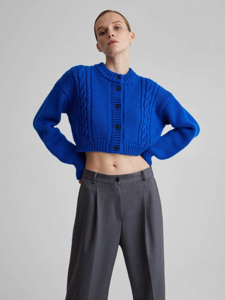
But who said that everything shiny has to be stored on the farthest shelf of the closet? This season, designers and street style heroes unanimously declare that in autumn you can wear not only black, brown and beige, but also rich blue, pink and purple. But how can you integrate this whole riot of colors into your everyday look?
We asked stylist and fashion blogger Adela Kaspanova to share a few lifehacks that you should definitely take note of. And as a bonus, we have collected 10 shiny things from Russian brands from our wish list.
Adela Kaspanova
Start with accessories
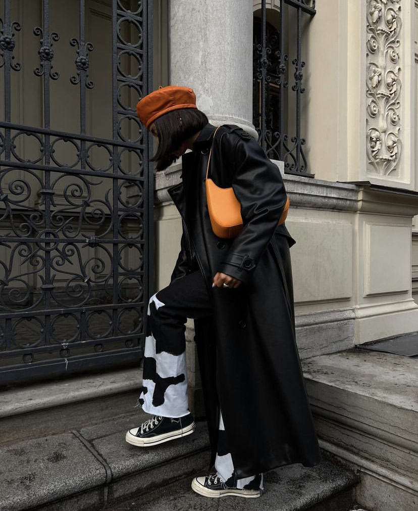
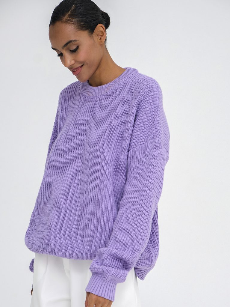
If you have never worn bright things and your wardrobe is dominated by a pastel palette, then you should start by adding color to the accessories. So you will understand which color is closer to you and it is better to combine it. By the way, to create a full-fledged image, I always advise you to try absolutely everything and try to figure out where this or that thing will look better. Be prepared that the accent accessory will go with almost anything and you can color it to the fullest.
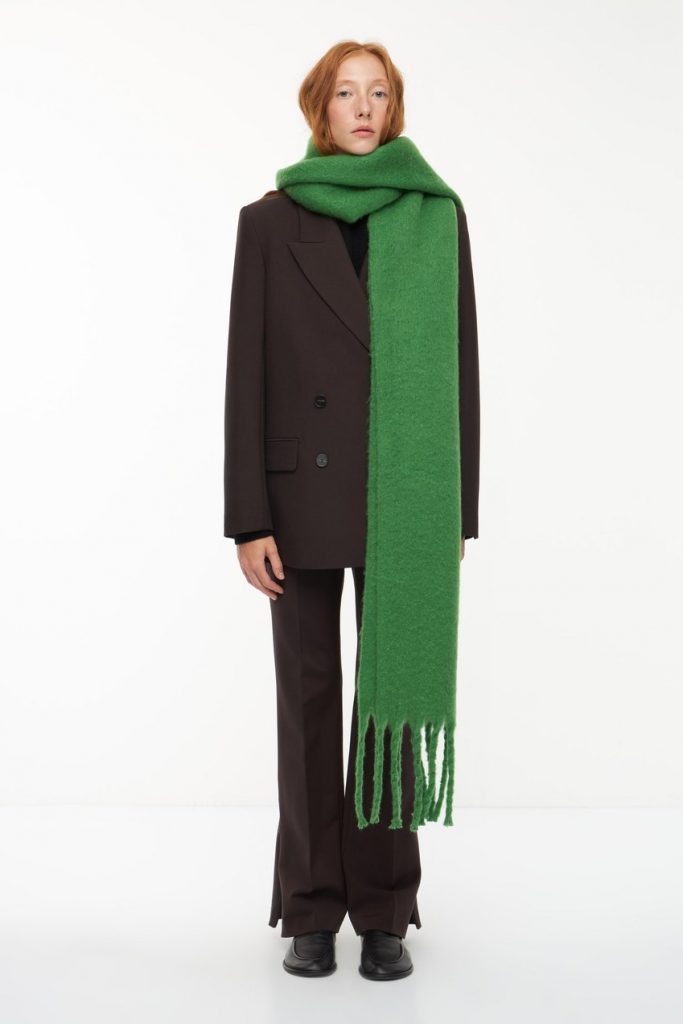
Do not mix more than two bright colors at a glance
Everything that is most stylish is simple. Any image should have logic: it is very important to treat it logically when combining bright colors. This is a fine line that should not be crossed in order not to look like a parrot. My golden rule is to keep the same warmth in the image so stick to the same contrast and tone. So, using green for example, build the contrast on it and don’t change its hue. For the neutrality of the overall picture, unsaturated colors such as black, white and gray will always help.
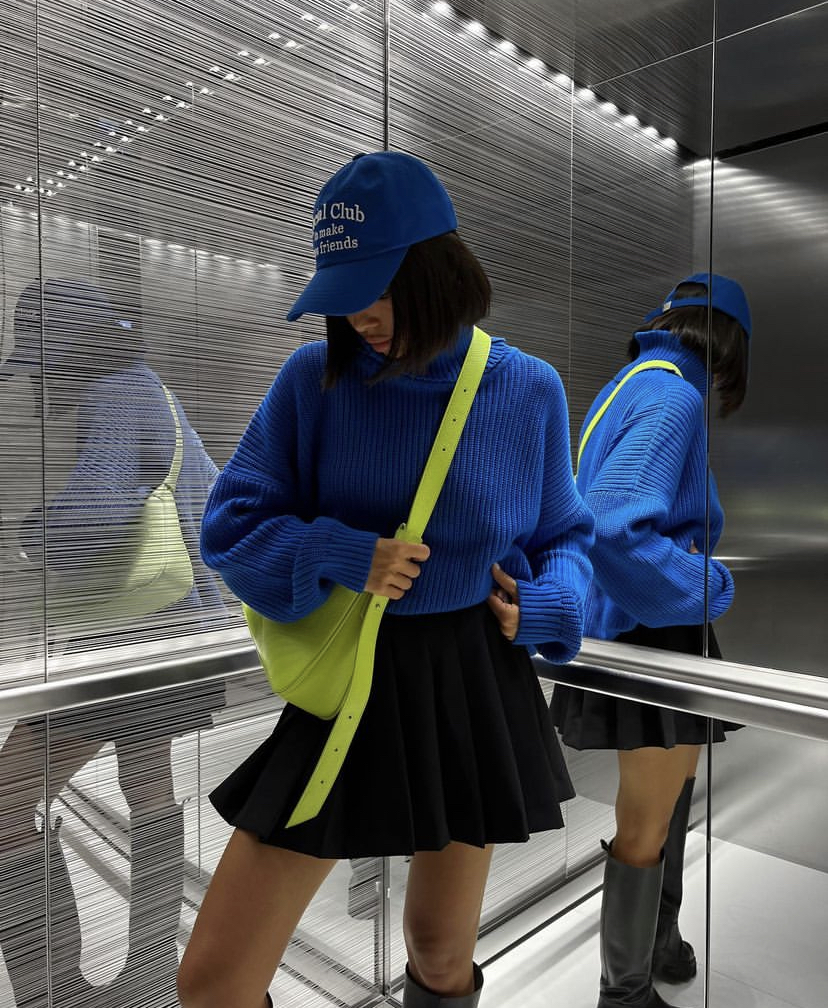
Focus on the bottom
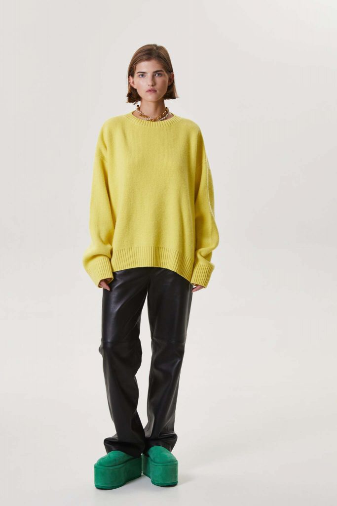
You can feel yourself in a new way by adding even one bright item to your wardrobe. For example, a portrait space with the right color and hue will open differently and look fresh. And for those who still do not take risks with the color of the face, I advise you to take a closer look at the bright lower part. Here your basic wardrobe will definitely balance the image and help.
don’t be afraid of color
It just so happened that many are afraid of color because of past impulsive purchases when it later collects dust on the shelf. This happens if there is no understanding of what to wear it with. Especially if it’s something out of the ordinary. It is important to understand that we are talking about current glossy models here. This situation is reversible: if you open the wardrobe, you see the whole palette, for example, beige, then this very bright T-shirt will be very diverse. And if you try to shape a single color by mirroring the same accessory, you can see how the gradation of the whole image will increase.
-
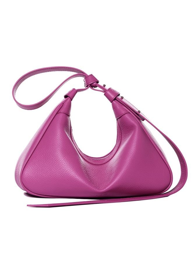
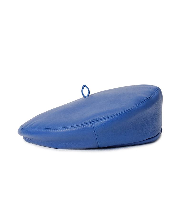
CNS – Coin Mark, 16 000 p. (coinsbrand.ru) -
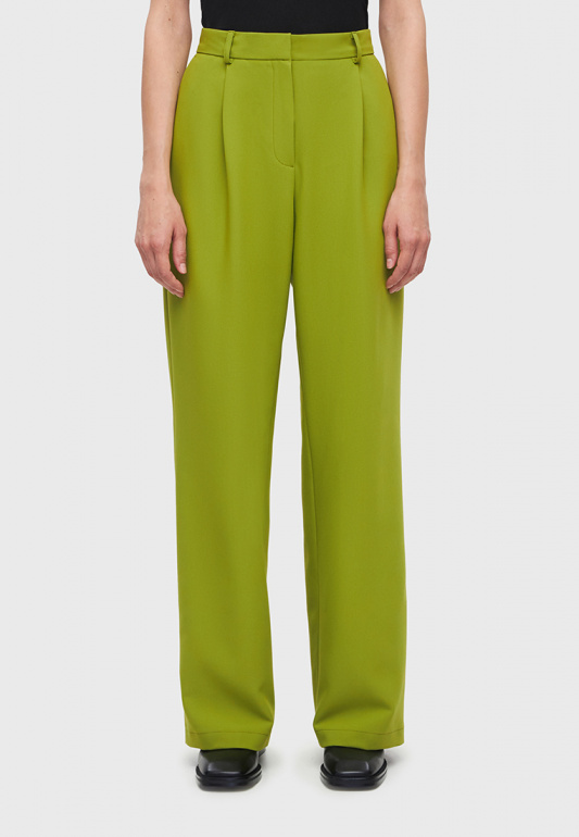
Studio 29 (studio-29.ru) -
Lime, 1999 p. (lime-shop.ru) -
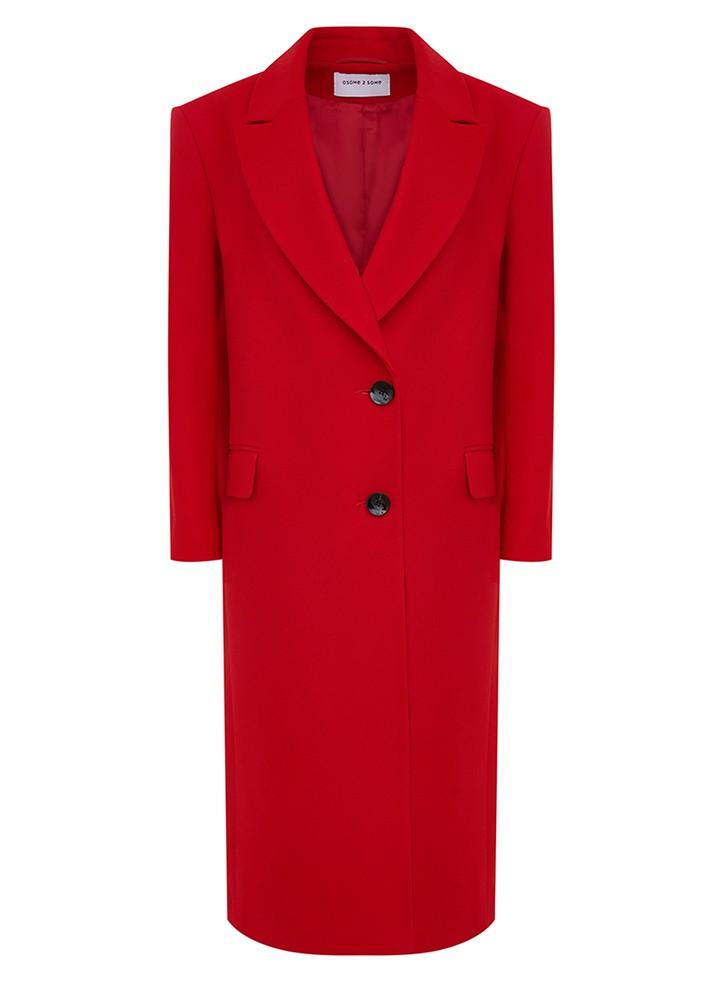
OSOME 2 SOME, $58,650 (osome2some.com) -
Charmstore, $6490 (charm.club) -
Choux, $20,986 (choux.ru) -
Cocoshnick Headdress, $16,000 (cocoshnick.ru) -
Moncashmere, $22,980 (moncashmere.com) -
2Mood, 9980 p. (2moodstore.com) -
purpose clo, 4950 p. (aimclo.ru)
Let’s be friends?
Source: People Talk
Richard Stock is an author at “The Fashion Vibes”. He is a lifestyle expert who provides readers with the latest news and trends in the world of fashion, beauty, food, and travel. With a sharp eye for detail and a passion for writing, Richard offers unique insights and perspectives on the topics he covers.


