

Recently, bright accents are increasingly appearing in monochrome looks, be it gloves, bags, coats and boots. But most of these bright colors have their own names, their own history and their own meaning that great designers have put into them. While you think rich pink was created by Paris Hilton and bright orange by Igor Sinyak, somewhere Elsa Schiaparelli and Thierry Hermes are crying respectively. We’ve put together a selection of 5 iconic colors you wear but don’t know who created them.
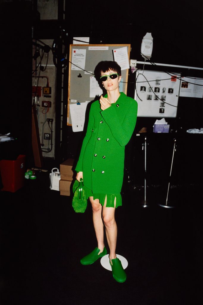
Shocking Pink
-
Schiaparelli SS21 -
Schiaparelli SS21 -
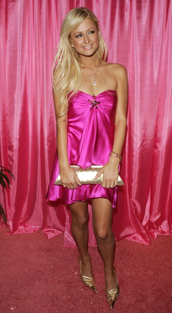
Paris Hilton. Photo: Getty Images
Shocking pink, created by Elsa Schiaparelli in 1937, became a symbol of courage and feminine power in fashion, and subsequently the main attribute of Paris Hilton. Schiaparelli saw her as the embodiment of energy, passion, and eccentricity, and contrasted her with traditional ideas of femininity. In 1937, color literally represented rebellion against dullness and routine. Over time, shocking pink became not just a hue but a cultural icon that inspired generations of designers, from Valentino to Barbie.
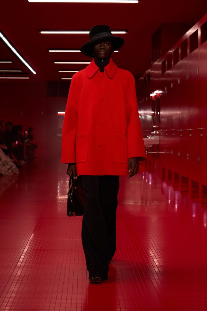
Hermes Orange
-
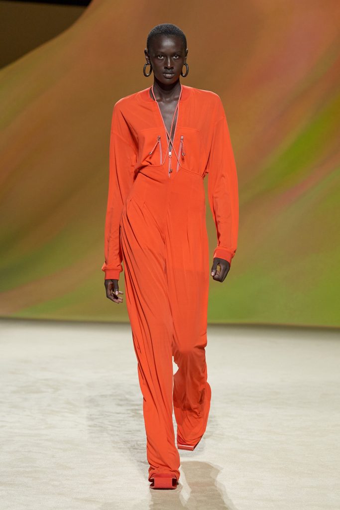
Hermès SS23 -
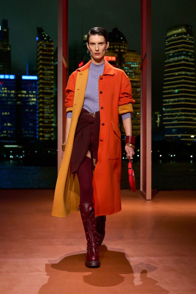
Hermès SS26 -
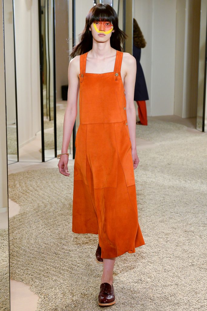
Hermès SS18
Hermès’ orange color has become a symbol as recognizable as the brand itself. It dates back to World War II, when the company had to use the remaining bright orange boxes due to material shortages. It started during World War II. Unexpectedly, this rich color fits perfectly with the spirit of the brand – bright, energetic yet noble. Over time, Hermès Orange became a visual code of status and craftsmanship associated with leather goods, crafts and the brand’s heritage.
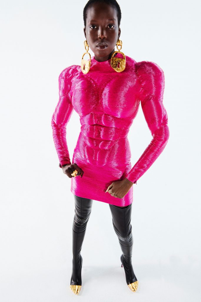
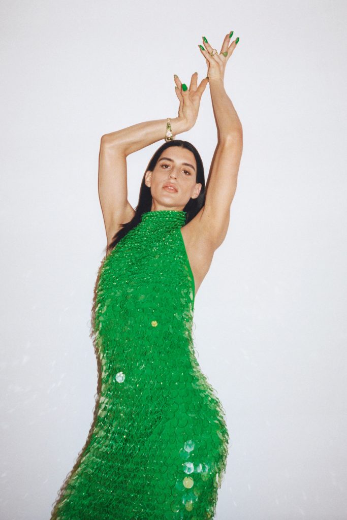
Bottega Green
-
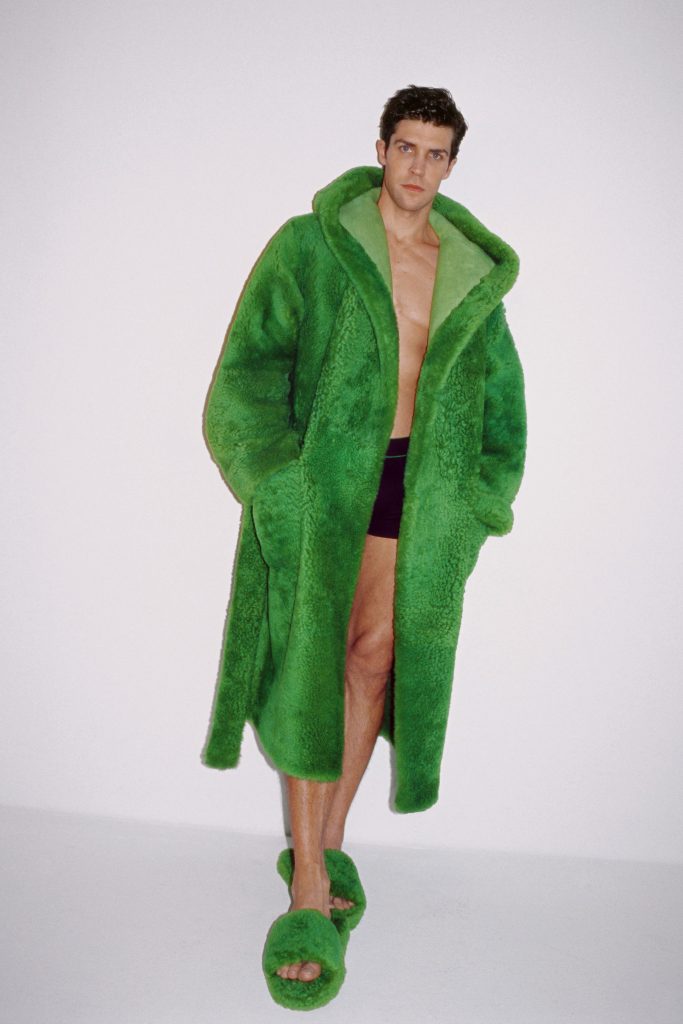
Bottega Veneta SS21 -
Bottega Veneta SS21 -
Bottega Veneta SS21
Bottega Veneta’s green color, known as Bottega Green, has become a modern symbol of Italian minimalist luxury. This bright, rich hue, which emerged during the reign of Daniel Lee, who was digging through the brand’s archives, instantly became a brand code. It embodies the idea of ”quiet luxury” without loud logos or flashy details – just confident green that speaks for itself.
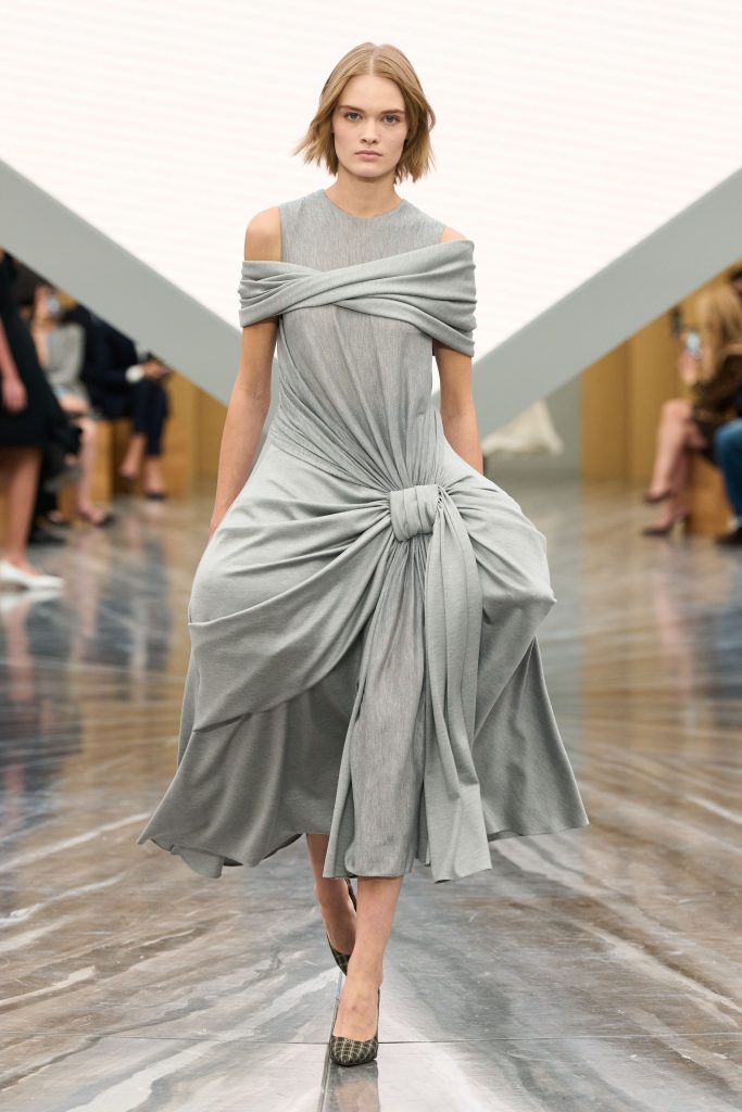
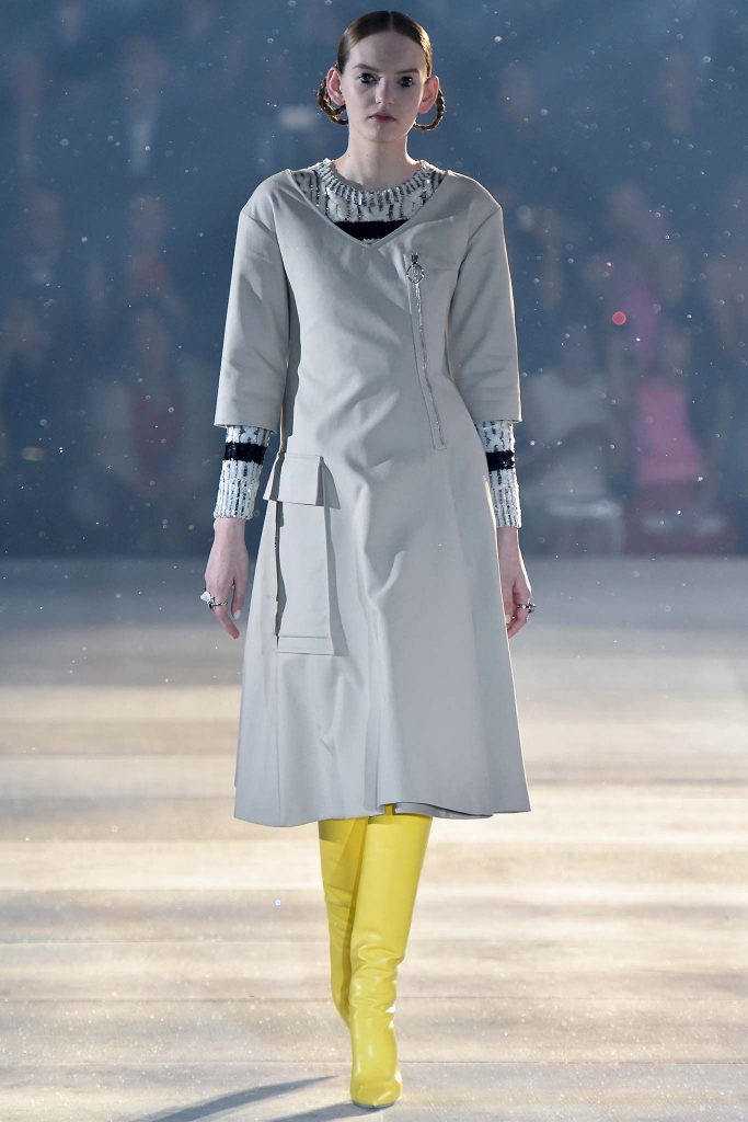
Dior Gray
-
Dior SS26 -
Dior SS15 -
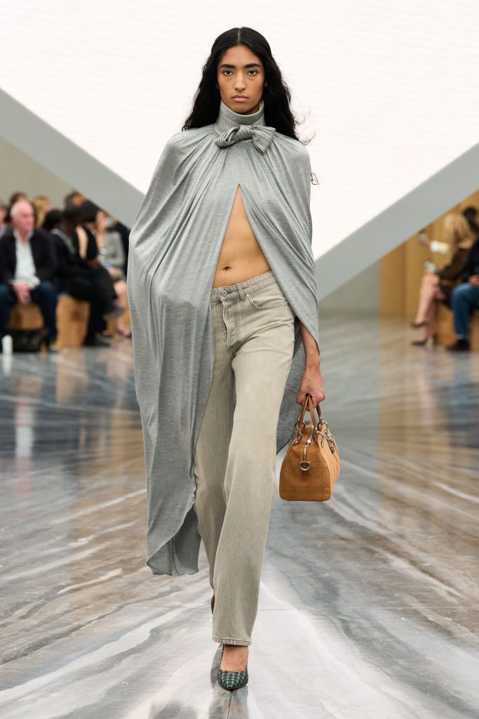
Dior SS26
Christian Dior chose the color Dior Gray because it perfectly combined femininity, tranquility and status. Soft, neutral and timeless, this design has become the brand’s hallmark and the perfect backdrop for the iconic New Look. Dior Gray is unremarkable, but that’s its power. Today this color is a symbol of sophisticated Parisian chic, which never goes out of fashion and, of course, from the wardrobe of Yana Rudkovskaya.
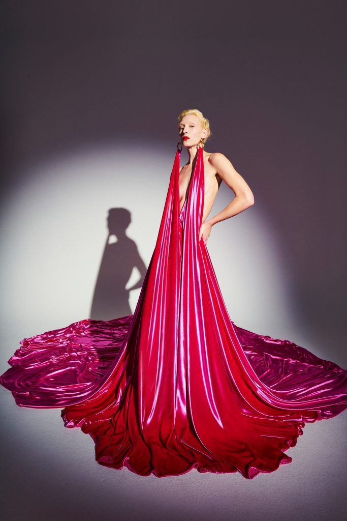
Valentino Red
-
Valentino SS26 -
Valentino SS25 -
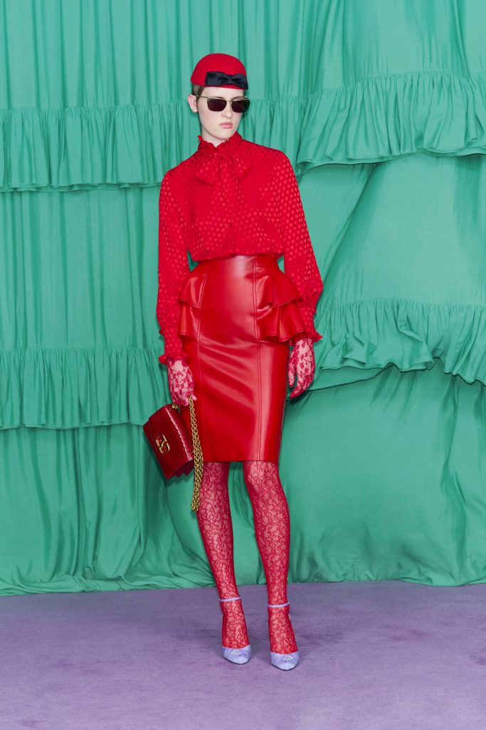
Valentino SS25
The symbol of passion and luxury is Valentino Red, created by Valentino Garavani in the 20th century. And he didn’t choose this by chance. This rich red color immediately attracts all attention. It has become synonymous with Italian elegance and an iconic element of almost every fashion house show. And although previously this color was chosen only for the final scenes of Hollywood films, today it can increasingly be seen on carpets, because it has become a symbol of true glamor.
Source: People Talk
Elizabeth Cabrera is an author and journalist who writes for The Fashion Vibes. With a talent for staying up-to-date on the latest news and trends, Elizabeth is dedicated to delivering informative and engaging articles that keep readers informed on the latest developments.

